Miina McCown/The Broadside
If you’ve ever been on Facebook, a Google interface or some other editorial site, you’ve probably seen this art style, whether you may have taken notice of it or not. If you’re like most people, myself included, you probably recognize this particular type of art and can say that you’ve seen it multiple times on the internet or maybe even in a magazine.
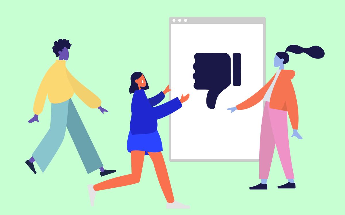
This vector-based art style involving large areas of flat color, minimal shading, large limbs, unrealistic skin colors, exaggerated proportions and geometric shapes, etc., (the list goes on) has come to be known as the “corporate” or “big tech” art style and has been heavily used by editorial illustrators and large corporations such as Facebook to advertise or decorate their interfaces or sites.

Facebook has adopted the name Alegria for this style, one of their artists describing it as “relatable, everyday stories with simple shapes, flattened perspective, and minimal linework” in this article.
As an illustrator myself, I can understand why this type of illustration has been so heavily utilized in recent years. It’s simple, fast, inoffensive and can be created with just a few clicks on a program like adobe illustrator if enough shortcuts are used.
Also, its uncomplicated look and allows for many artists to contribute to a project such as Facebook’s illustration system while keeping the look consistent. This article goes into more depth about the similarities of modern editorial illustrations.
It even points out that by simply googling the word “illustration” and going into Google Images, the first few results all consist of a style similar in appearance. And sure enough, after trying it myself, it’s true.
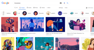
So, why does this corporate style feel fake? To rephrase the question, why does it feel inauthentic or not like real “art”?
When viewing this style from an artistic standpoint, it’s not technically “bad.” It translates well due to its simplicity, it’s playful and some might call it fun to look at. And the composition and color selections make for some visually pleasing images.
However, as an artist and as a viewer of this style, it doesn’t feel authentic. While art exists to evoke some kind of emotion, feeling or to convey a message, this style only ultimately exists to serve the purpose of advertising or promulgating a brand or product. They are merely created with no intention other than doing so, and the result is shiny, utopian images with no real underlying idea or message.
Instead of creating “art” all under the same style, as we progress into the future of the internet and editorial design and illustration, we should aim to be more authentic and personable with one another. There is a way to let each brand and individual be truly creative and to advertise without falling into the trap of the same art style that is seen everywhere lately.
Authenticity and true artistic quality can be achieved even when advertising a brand or decorating an editorial layout, and it can start with each individual being more genuine rather than reverting to what is commonly used.






LO | Jun 16, 2021 at 1:24 pm
This is big tech’s halfhearted attempt to put its wary consumers at ease with the new oligarchical corporate surveillance state. Yuck.
LO | Jun 16, 2021 at 1:24 pm
This is big tech’s halfhearted attempt to put its wary consumers at ease with the new oligarchical corporate surveillance state. Yuck.